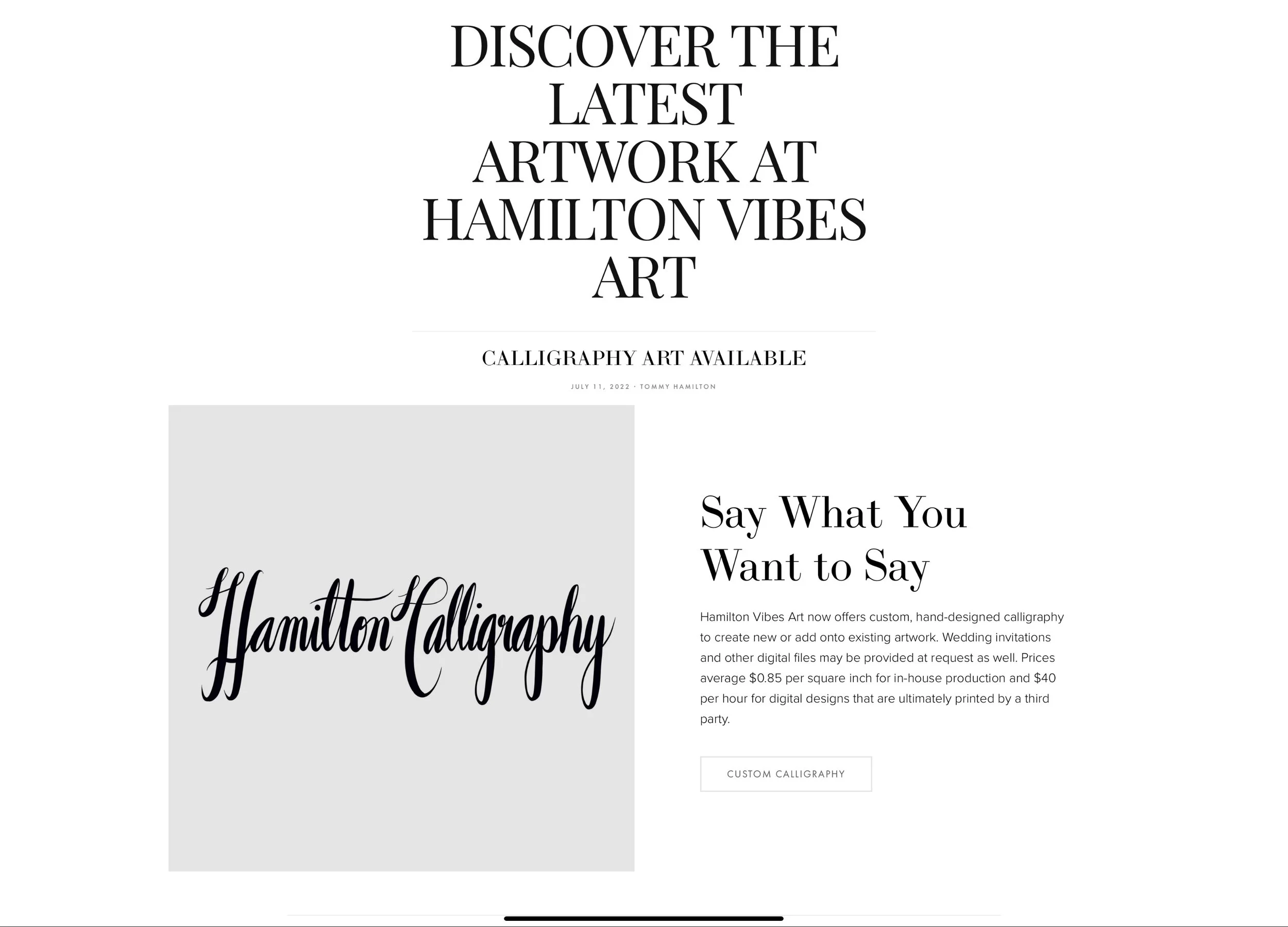
News Tab Redesign: From Passive to Interactive
Problem: The original News tab functioned more like a static blog post—a general update zone with no user interaction or clear navigation paths. While it shared brand updates, it didn’t drive user action or help customers discover new features of the site.
Process: The redesigned News section reimagines announcements as conversion opportunities. Each news entry now highlights specific updates (like new calligraphy offerings or featured pieces) with visual hierarchy, sectioned content blocks, and direct call-to-action buttons. This reduces cognitive load by eliminating unnecessary tab switching—users can jump straight to the relevant shop section or commission form with a single click.
The addition of bold, styled titles and preview text allows for scannability—visitors can easily pick out the stories that matter most to them. Each update strategically leads the user to a different high-traffic area of the site, driving traffic across multiple verticals (custom art, print shop, featured collections).
Impact: Engagement with the News tab has shifted from passive reading to interactive browsing. By combining storytelling with functional CTAs, the section now supports task completion, not just awareness. This turns casual interest into meaningful user flow.
Future Improvements: Adding filters or category tags (e.g., “New Product,” “Event,” “Announcement”) could enhance usability further. Consider integrating subtle animations or hover states on cards to increase perceived interactivity and visual delight. Analytics integration would help identify which types of news generate the most click-through.
Old news feed (above)
New news feed (above)

